Thursday, July 5, 2012

Castle Butte, Montana

Each month many of the forums at WetCanvas.com post a monthly 'challenge'. One of the members posts one or more photographs and the challenge is to produce a painting in you own personal style and media. Some of the challenges are media specific as in the Watercolor Studio forum. Others are open to all mediums with their challenges directed towards a particular subject such as Southwest and Western Art forum.

I usually try to visit the Southwest and Western Art forum on a regular basis and I was attracted to the June challenge posting. Unfortunately my muse didn't speak to me until it was July! Here is my humble efforts to paint Castle Butte, Montana.

Castle Butte, Montana 11x15 inches, Watercolour and Acrylic Ink or Saunders-Waterford 200# CP


Saturday, April 14, 2012

An Abstract Sleeping Giant


It the beginning of the month and many of the WetCanvas forums will be posting a 'challenge' to be painted. I first checked the watercolour forum. No. I'm not going to paint a flower, or a least not right away. Maybe later. Next I check the Southwest and Western Art forum. 10 scenic pictures of the Helena area of Montana but nothing that reaches out and says to me: “Paint me!”. Maybe I'll have better luck on some of the other forums.

A couple of days later and I still haven't found inspiration in any of the April challenges. Instead, I'm working on another of my Tuscan cityscape series. I review S&WA again. Maybe there is a picture in the rocks, the last photograph and then again maybe there isn't.

Eventually I check the photographs in the April challenge on the Southwest and Western Art forum for a third time. This time I carefully read the accompanying text and google 'the sleeping giant' Montana. I spend a hour or so dreaming about the second photograph in this post. I like the hard diagonal ramp for left to right in this photograph. Then there are the strong contrasts of the mid-ground hill and the dark trees that give rise to some interesting abstract shapes. Finally there is the sleeping giant itself in the distance. OK. Foreground, mid-ground and a background plus the sky. All the elements I need for a landscape painting. I'll just stir into the mix in a little Frank Lloyd Wright a'la Talissin West from Milton Sticker's Design through Abstraction and see what develops.

The starting point:
 
 
Using this reference photograph, I made a full size (15x22) pencil sketch of the scene.

 
I taped this sketch down to my painting table and placed a second layer of tracing paper over it. My painting table is white, or mostly white so the sketch shows through without much problem. I used a small straight edge and a soft lead pencil to re-trace the sketch while removing most of the curves. I also added or emphasised some of the background mountains and sharpened their peaks.
In the final overlay, I further emphasised some additional lines, added some sky lines and the abstracted clouds, and the foreground abstract shape. This image was transferred to the watercolour paper by blacking the back of the sheet with a soft lead pencil and tracing the major lines with a blunt lead. This provided a light image that I could use to lay down the sky lines, profile of the mountains and the foreground lines in India Ink and black acrylic paint. Additional lines were added directly on the watercolour sheet with pens and acrylic paint pens.
 
Once the ink and acrylic was dry, watercolour was added in a series of washes to complete the image.


Faber-Castell Pitt India Ink pens Black and Sepia, Decocolor Acrylic Black paint pen, and Daniel Smith watercolours on 200# Suanders-Waterford CP. 15x22

 I hope you enjoy it.


Saturday, March 31, 2012

Westminster Sunrise


I just love the Thames and Westminster is one of my favourite places. Maybe it a bit of obsessive compulsive feeling for this area, but I do keep returning to it in my paintings. It's usually full of tourists during the summer months. So much to see. So much to do. The south bank, London Eye, the Tate, the Houses of Parliament, Whitehall, Trafalgar Sq., the National, the Mall and Buckingham Palace and many more places to go, to see, to paint.

Earlier this spring, I decided to paint a skyline of Westminster bridge and the Houses of Parliament but with a twist. I had a photo of a watercolour of Venice painted in a style similar to Charles Reed. My thoughts were to use that painting style on the upper buildings and blend this into the darkness of the river. Here is that early spring attempt.


The buildings turned out OK but overall it was a bit of a failure. The Thames and Westminster Bridge disappeared into the blue gunk at the bottom of the painting. After some thought, I knew what I wanted and I knew that I needed to do a couple of value studies.


The first study (top-left) was a simple three value study. This solid, non-gradated study isn't going in the direction I wanted. The second study (top-right) with a gradation from right to left and somewhat from top to bottom exactly the image I wanted to paint. The third (bottom-left) done with a sky wash failed again. The last study in colour also is moving in the direction I wanted to go.

So I've done the studies and I know where I want to take the painting. Just a quick light sketch and I'm can start to sling paint. Right? Wrong! The original painting and the four studies stayed pined to the wall for 3 three months before I decided to take them down and have another go at this subject. I think it's an improvement over the original. I also think there is still room for improvement. Maybe I will revisit it in a couple of months and maybe I'll be happy with the results and maybe fish will learn to fly.  Enjoy


Sunday, March 25, 2012

Abstracting a landscape


A few days ago, Kate Withers started a new thread on the Composition and Design forum of WetCanvas: 'breaking the rule of centering' (sic). She explained that she likes a centred composition and doesn't defer to the many art books and teachers that tell you not to centre your centre of interest. Kate included her recently complete painting 'Queen of Spades Range'.


I was hooked at first sight. I just knew that I had to paint my vision of this scene. My compulsion was a slight overdose of Frank Lloyd Wright via a student of his: Milton Stricker and his online book on "Design through Abstraction – The Wright Source to Art and Architecture". If you are struggling as I am with trying to see and paint the abstract shapes of nature, I recommend reading this excellent publication. It's not all about art and abstraction, but the images alone make it a worth while investment of the time needed to traverse this document.

Google (Queen of Spades Range) turned out to be no help at all. Not a single photograph of this area which surprised me so I had to work from Kate's painting. I cropped the image she had posted and then stretched it back to a square composition. From this image I drew a light pencil sketch on 200# Saunders-Waterford CP watercolour paper. Using a ruler I straightened the curves with darker lines, some of which I extended beyond that lines of the original sketch. I then used some recently acquired Decocolor Acrylic paint markers to trace over the straight lines. I used red for the mountain and black for the lower slopes.

I turned the painting so that the sky was tilted downward. First a wash of water with just a hint of Raw Senna, followed immediately by another wash with a bit more Raw Senna and finally while still very wet, a third rich wash of Raw Senna. I then removed the tilt and encouraged the paint to granulate by shaking it slightly. It was then allowed to dry completely. The mountains got a similar treatment using Ultramarine Blue with some darker blues dropped in after the main washes. The foreground received a wash of Raw Senna with some darker yellows added to give contrast. I hope you like it.


Thursday, February 9, 2012

Northville Art House: 6th Annual Member Exhibition


Art House, Northville, Michigan

If you happen to be in the Detroit area between February 3 and 18, 2012, and have a spare hour, drop in on the Art House in Northville and see the 6th annual members show. I was amazed at the quality of the work considering that it is a non-juried show. Most of the works are for sale and judging by the number of sales during the hour or so I was there on opening night, I would expect that a large percentage of he paintings on display will be sold.

Art House
215 W Cady St. (just north of 7-mile and Sheldon)
Northville Michigan
248-334-0497
Gallery Hours 1-5 pm Wednesday-Saturday

If you miss this excellent mini-show, there is a sale, 'Art from the Attic' on the evening of Friday, February 24, and during the day on the Saturday and Sunday. I expect some keen prices. Joan gave me the heads up that an Alexander Calder lithograph is being offered in this show-sale. Not too shabby for a small town art gallery.

Saturday, January 28, 2012

Composition: Practice what you Preach!

For almost all of the past year I have been studying visual composition. Reading books and everything I can locate on the Internet. Taking part in forum discussions regarding composition and looking over images and sketches related to composition. The one thing I haven't been doing is practising composition.

During my first year of watercolour painting I discovered that nothing but nothing beats practice. You can purchase the finest brushes, the best watercolour paint, expensive palettes, top quality paper, watch DVD's by great artists, read their books, debate the pros and cons of a particular artists techniques, but unless you put brush-water-paint to paper, you will never learn how to paint.

Also during that first year, I watched with amazement and eventually a growing irritation, one member of an artist on-line forum, debate, research, discuss, and expound on: brushes, pigments, paper, palettes, easels, and even water containers. During that year, R never posted a single painting, but he became and 'expert' on most-all things watercolour, holding forth at great length about almost anything related to watercolour painting. Then one day, one of the forum moderators grew tired of his opinions and publicly challenged him: “Put up or shut up!” This resulted in another very long complaint thread on how it was wrong to insist that members should post their work to the forum. Eventually R relented and posted one rather weak example of his work. Shortly there after, he offered all his large collection of painting supplies for sale on the forum swap shop and that was the last he was heard from.

There was nothing wrong with most of R's posts. They were knowledgeable and well researched. The only problem with R is he never painted or made any used of the excellent brushes he had accumulated. Malcolm Gladwell in 'Outliers' describes the 10,000 hour rule. Basically it takes 10,000 hours of practice to be come expert at a skill. Larry Seiler advises to paint 120 paintings as you need this many to work through your mistakes. Whatever the number, if you want to learn to paint watercolour paintings, paint watercolour paintings! Nothing else works!

...and if you want to learn composition, you need to practice composition, and I haven't practising composition until this week when I re-started attending the local adult education watercolour painting class. I missed all but one of the autumn classes due to working on our new (to us) condo. In fact, I didn't paint from July until November. Starting back painting was a big problem. I found it very difficult to get back into the grove of painting every day. With the start of the winter session of adult education classes, I decided to go along, to force myself to paint more. A New Years resolution to myself was to paint at least 4 hours a day.

I did manage to attend class for 1 day in the autumn session. The new instructor was offering a lesson series of near 'paint by numbers' watercolour subjects. A pre-composed scene with instructions to draw of trace an outline, paint this wash in this colour. Then... The same type of lessons I had from my first tutor. Zero creativity and self expression and in my opinion little learning. Oh you learn to paint a painting that looks like the one the instructor painted, but you aren't learning how to paint. A Bob Ross watercolour lesson. I didn't like it then and I don't like it now, so I decided that I would use each weekly lesson as a composition exercise. Each week I would take the components in the lesson and design a new and hopefully interesting composition.
  • I would look at the original components, think about how some or all of them could be rearranged into and interesting design.  
  • I would do some thumbnail sketches to try out these design ideas.
  • Would a format change be of benefit?
  • Do value plan/pattern need to be changed?
  • What abstract armature will work to organize the space division?
This the image the tutor supplied for us to paint for this week.
 
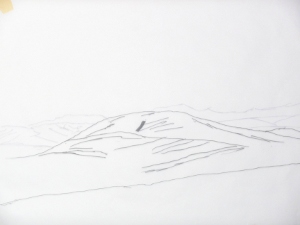
I decided I would try to paint within the two and half hours of the class, a completely different composition based on the photo that the instructor provided. Needless to say, I didn't manage to finish the painting, but I did manage to make a start. After a few minutes thought, my could see that a quarter sheet portrait format wasn't going to work for me. I envisioned a over long, 2:1 portrait format for my new composition. Here is the page from my sketch book with my thumbnails.

 
I admit that they are not the best thumbnails you will find. I hope you can see from the bottom left sketch that I wanted an over tall portrait painting, but I only had quarter sheets of watercolour paper with me, so I resigned myself to a working within that format in the classroom. I sketched a best fit image onto the quarter sheet, and with half an ear listening to the tutor I proceeded to paint this rather poor watercolour.

The white block near the bottom was going to be the buggy. I added a stone wall in the foreground as that was what the rest of the class was doing at the time and my brook in the middle ground didn't work out either. Thoroughly discussed with the results, I put this project aside for a day. After a break and more thought, I did a full size contour sketch with the 2:1 format I originally envisioned.

Using this sketch, I painted my second attempt at this subject. After some time, I realised this this was working either. I would say that the four horizontal divisions is one too many divisions.
Which brings me to my final offering for this particular subject. It's still and over tall portrait format but now reduced to a foreground, middle ground, and background-sky. It thinks this one works.
 
I hope you enjoyed this little design exercise and maybe there was a small lesson in it for you.

Thursday, January 12, 2012

Cortona Italy: a watercolour

Here is yet another trip to the Tuscan roof tops. This time I used Cortona, Italy as a starting point and with the help of GIMP, made some minor rearrangements. I have been having a struggle and continue to struggle with settling down to paint. I turned off the tap back in June for a holiday break with Jill. Then the condo sale went through and I was very busy working on it until the end of November. Christmas was taken over by a bad head cold that dragged into January. I tried to paint throughout this time, but it seemed to be such an effort even with the new studio.

Browsing through my image library, I decided to return to my love of the Italian countryside, walled cities with red tiled roofs. I've done a couple of these Tuscan landscapes and I greatly enjoyed to process so when I came across some photos of Cortona, I decided, maybe it was time to return to this subject. Getting started on Cortona was a struggle, but once I got past the initial washes I started to get into the flow. The more I painted the better I felt and the better I felt, the easier it was to paint.

I still haven't overcome all the down feelings I have, and it remains a struggle to paint, but I know that I can choose another Tuscan scene as get back into the groove. I'm not very well pleased with the result. I expect that I will have to re-visit this scene sometime soon and try harder. I hope you enjoy it.